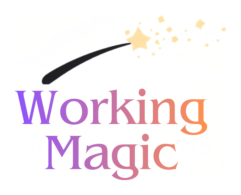
I had a client who hired me to redesign the logo for her website, Working Magic. She had a very basic logo she made herself of a wand with a star at the tip over the title of her website in text colored with a gradient. She liked the individual elements of the wand and the text, but she wanted something more dynamic and with different proportions
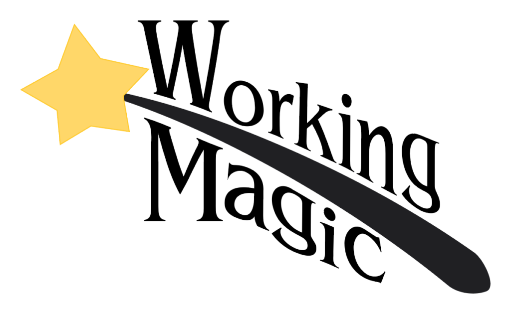
My first idea was to have the words sandwiching the wand, with the wand angled down from left to right to fit the words. The client pointed out that this gave the logo a “descending” feeling, so I made a revision with the wand angled up, which the client liked better, but she wanted to explore different directions as well. I went back to the drawing board and tried to look at the elements with new eyes.
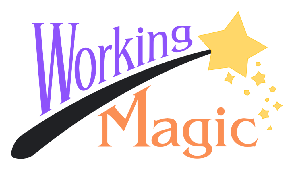
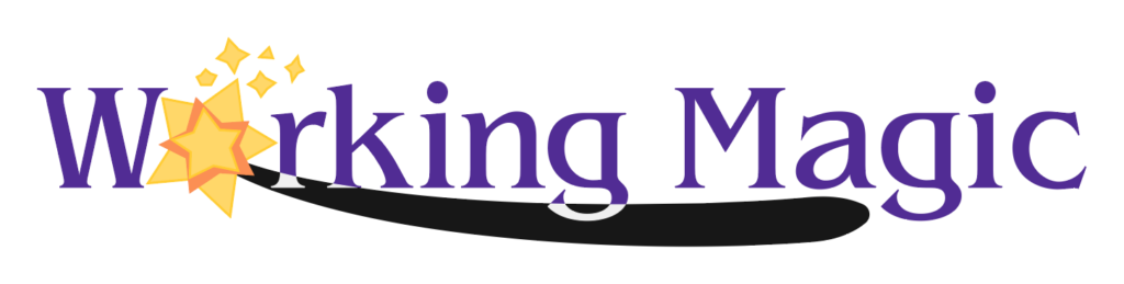
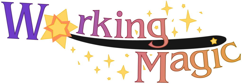
I came up with the idea of using the star at the end of the wand as the “o” in “Working”, with the rest of the wand underlining the text. The client really liked this direction, but thought the straight text wasn’t dynamic enough. We finally landed on a design where the words curved with the wand, and sparkles came out of the end of the wand and curled around the design.